

Garamond Google Font Pairing
We are back with another edition of Stimulus Font Pairings! On this week's installment, we are looking at the Garamond font family. As a little backstory, keep reading!
We've all been there:
"What font goes best with ______________?"
Finding the right font pairing can be challenging. Whether it's for a print piece or for a website, font harmony can make a huge difference to the impact of your piece. Let's take a look at the very popular and versatile Google font—Garamond. Below we explain the history of the font, its characteristics and four good font pairings that can be used on print collateral or web design.
History
Garamond is a classic typeface that has been in use for many years, going all the way back to the typesetting days of the 1500’s. The typeface was designed by a French type-designer, punch-cutter and publisher named Claude Garamond, who the font is named for. Typefaces like Garamond began to take form after Blackletter because it was easier than the ornamental letterforms to carve out the metal molds and was easier to read when printed. Because Garamond is such a classic and elegant serif, it has inspired other fonts and has been adapted for modern use. Using a serif such as Garamond creates a sense of tradition and trustworthiness in viewers, making it a great academic and branding choice.
Characteristics
Garamond is a serif font, meaning it has small strokes at the beginnings and ends of the main forms of the letter. Garamond’s serifs are slightly curved at the base and slope downwards on the ascenders. The x-height of Garamond is relatively short, making the capital characters appear large in comparison. Garamond was the first font to break away from the handwritten look of letterforms, as it made the letters more readable in print.
Font Pairing 1: Raleway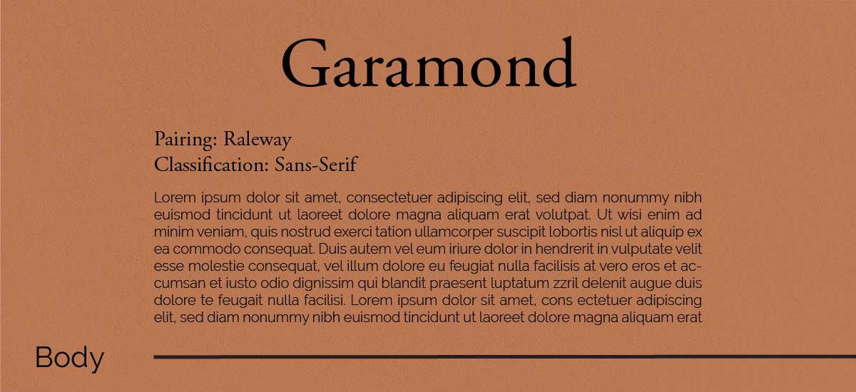
Classification: Sans-Serif
Use: Body Text
This pairing is a great mashup of new and old! We chose to pair Garamond with a more modern typeface such as Raleway. This font adds a nice contrast of thin, mono-weight lines to the thicker, more complex letterforms of Garamond. Raleway is a very rounded, geometric sans serif, which is very different to the style of an Old Style Serif, which is what Garamond is classified as. While both fonts are vastly different from one another, their differences work together to create a sense of hierarchy and visual contrast.
Pairing 2: Unifraktur Maguntia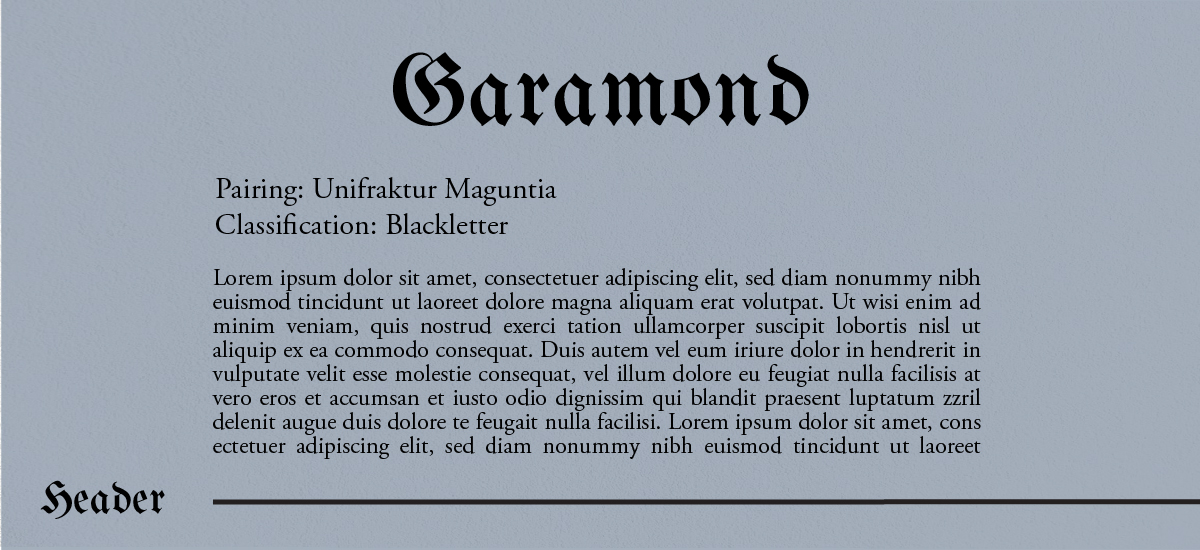
Classification: Blackletter
Use: Header
This pairing is a throwback to blackletter! We chose to pair Garamond with a blackletter font because the two originated around the same time. The forms of both fonts complement each other well. Garamond was simplified from written forms such as Blackletter, so it functions well as a body text under a blackletter heading.
We chose this font as a header because of its “Old English” style. It is a bold, strong font and should be used minimally throughout your designs in order to have the strongest impact.
This pairing can be great for a specific social media campaign or for a short-term marketing campaign where you need something different that will stand out.
Pairing 3: Cormorant Garamond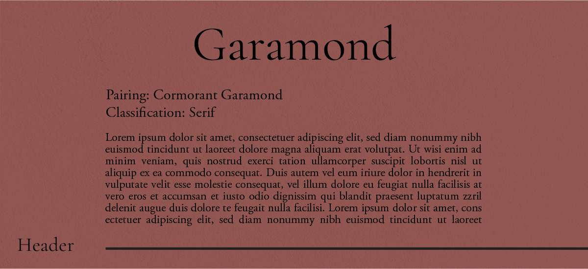
Classification: Serif
Use: Header
Now what could we say about Cormorant Garamond? A lot actually! It isn’t a font that is on the tip of everyone’s tongue, but it works well with Garamond.
We chose this font pairing because it combines a more modern-looking serif with the Old Style Garamond. Cormorant Garamond brings a more modern appeal without being a sans serif.
Cormorant has a much higher x-height than Garamond, which makes it stand out from the other font in the pair. The shape of the serifs on Cormorant are much sharper and geometric, standing out from the rounded shapes of Garamond.
If your goal is to have something “different,” then we definitely suggest giving Cormorant a try.
Pairing 4: Europa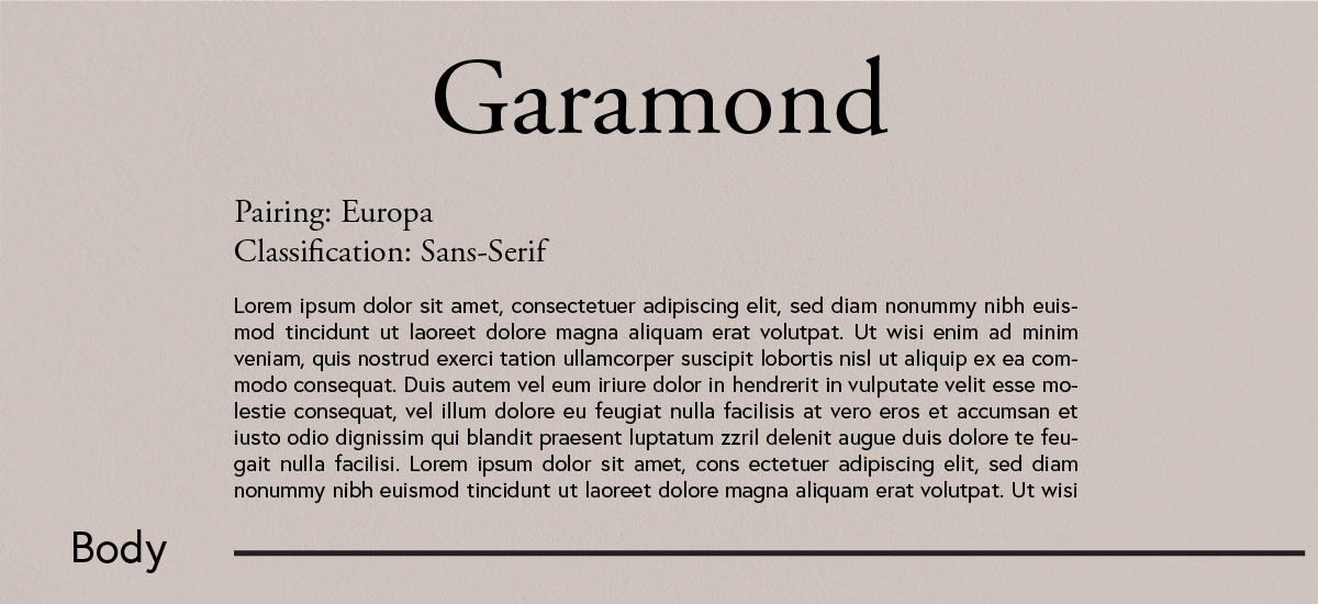
Classification: Sans-Serif
Use: Body text
Europa is a great modern body text which is a slightly heavier pairing option than Raleway. Like Raleway, Europa compliments the new with the old! The tall x-heights and simplified shapes of the letterforms makes this font easy to read, especially in larger sections of text, making it a great body copy choice. Garamond’s high contrast of thick to thin shapes stands out nicely against a mono-weight sans-serif.
This pairing is a great option for web articles because Garamond creates a sense of academia, while Europa brings a modern, easy to read element to the table.
Thank you for tuning in for another edition of our font pairing series. Make sure to connect with us on social media where we will let you know each time we have a new blog post. Until the next font pairing, design wisely and create!
NEED A HAND WITH YOUR NEXT DESIGN PROJECT?
Stimulus Advertising is a full-service marketing and advertising agency. We work to provide creative services to companies and organizations within a variety of business segments and markets. If you are looking for a team to help you with your next design project, look no further than Stimulus! Our team of highly-trained designers and web developers will help you with anything from a new logo/brand to a new website and everything in between. Contact us today to learn more about our services and tell your brand story!


