

Amiri Google Font Pairing
Font pairings are so satisfying when you treat them as an artform! Continuing our Font Pairing Saga with the Amiri font family, we at Stimulus are once again answering the question:
“What font goes best with ____________?"
Pairing fonts can be super tricky but keeping your eye on the type and how the two flow can truly make for an impactful combination in your design. This time, we are looking at the very naturalistic google font – Amiri. Keep reading to learn about the history of the font itself, the characteristics, and our top choices for font pairings!
HISTORY
“Amiri” is an elegant but simple Arabic typeface designed by Dr. Khaled Hosny, an Egyptian Type designer and computer scientist. The typeface started development in 2008 as part of the Khatt Project, an effort to create high quality Arabic fonts that would be available for anyone to use and contribute to. The design process involved extensive research and was released in 2011 under the (OFL) or Open Font License. Since then, Amiri has become a widely popular font and exemplifies the power of open-source initiatives as well as promoting cultural inclusivity.
Characteristics
As a font, Amiri has excellent legibility—even at small sizes. Each character has been carefully crafted to ensure clarity and readability, making it both a great header and body copy font. Amiri draws inspiration from classical Arabic calligraphy and uses fluidity within the letterforms. It is similar in style to traditional handwritten script. Amiri’s style is best described as “classic” and “simplistically elegant.” It exudes a sense of timelessness and sophistication. The various weights allow versatile type use for many different design projects. The flexibility enables designers to create the visual hierarchies necessary to emphasize specific content.
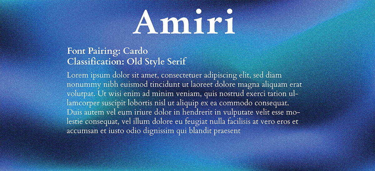
Font Pairing 1: Cardo
Classification: Sans Serif
Use: Body Text
Cardo along with Amiri creates a harmonious typographic pairing. It’s an ideal pairing because of Amiri’s elegant simplistic typeface and Cardo’s sophisticated serif style.
Like Amiri’s prominent Arabic History, Cardo has roots within ancient calligraphy as well. Within the type itself, there are small decorative strokes at the end of the main strokes of letters, which help guide the eyes along the lines of text.
Its classical appeal helps provide an engaging visual experience by ensuring a smooth transition from Header to Body.
This font pairing is great for publications, digital archives, and projects using historical texts. The font was designed to provide an aesthetically pleasing design for Biblical scholars, linguists and the like.
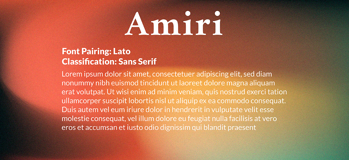
Font Pairing 2: Lato
Classification: Sans Serif
Use: Body Text
Combining the grace of Arabic handwritten calligraphy with the modern appeal of Lato’s Latin font, the pair strike a perfect balance between traditional type and sleek lettering.
Lato is a popular and versatile typeface designed by Lukasz Dziedzic. Besides being very modernistic, Lato can be classified as a very warm and friendly font in appearance. The x-height for this type is relatively large, making it highly readable, especially at small sizes or in lengthy paragraphs.
This font combination is ideal for providing cohesion in editorial layouts, branding, or web designs.
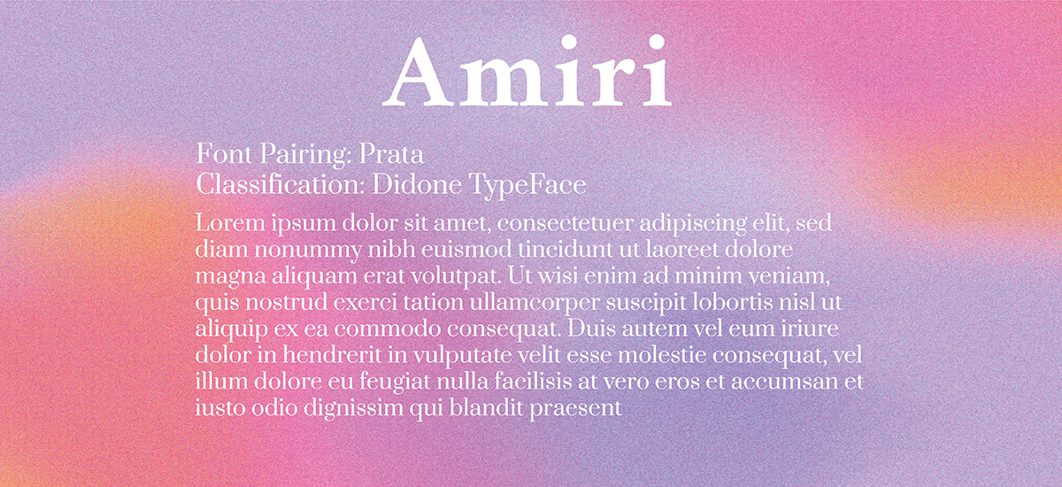
Font Pairing 3: Prata
Classification: Didone Typeface
Use: Body Text
The delicate serifs and timeless appeal of Prata will create a pleasant contrast to the unique but formulated details of Amiri. The two fonts share similar proportions and x-heights, creating a typeface family feel.
This charming letterform emulates the calligraphic style of 17th century Baroque typefaces. Airey and light, the combination of Amiri and Prata can give a sense of joy and beauty, which is why this pairing is best used for invitations, weddings, and overall design projects that are fun and bubbly.
Projects with a sophisticated, lighthearted aura will benefit from this excellent pairing.
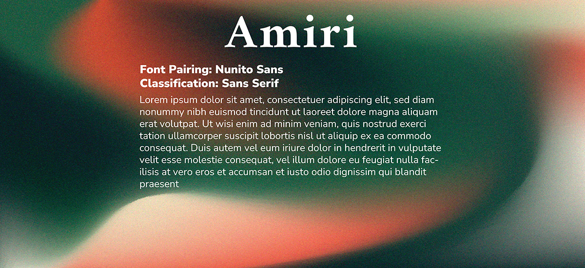
Font Pairing 4: Nunito Sans
Classification: Sans Serif
Use: Body Text
Clean stroke lines supplied by Nunito Sans create a wonderful body text that is so seamlessly adorned by the Amiri header. This typography combination provides a homely handwritten aesthetic.
Nunito Sans was developed by Vernon Adams. Adams created the font in hopes of striking balance between geometric and organic forms, therefore resulting in a visually pleasing typeface. Its variants come in multiple weights and styles, providing a wide range of options for various design and typographic needs.
Though suited for a wide range of applications, it is often used in web design, print materials, user interfaces (UI), mobile applications, branding, and other contemporary projects. Along with Amiri, the two fonts combine to create a balanced but personalized experience for each reader.
Providing you with great font pairings is our pleasure and we truly hope you stick around for more in the future! Be sure to follow us as we continue our journey to provide perfect font pairings for all designers looking to elevate their projects! Let us know what font you want to see next.
NEED A HAND WITH YOUR NEXT DESIGN PROJECT?
Stimulus Advertising is a full-service marketing and advertising agency. We work to provide creative services to companies and organizations within a variety of business segments and markets. If you are looking for a team to help you with your next design project, look no further than Stimulus! Our team of highly-trained designers and web developers will help you with anything from a new logo/brand to a new website and everything in between. Contact us today to learn more about our services and tell your brand story!


