

How to Properly Use Script Fonts
Avoiding the Curse of the "Wedding Fonts"
We've been talking around the office about a trend that has been getting bigger within the last year or so. The "wedding font." The "curse of the wedding font," actually. What do we mean by that? Well, to put it simply, it’s that elusive script font that promises elegance and romance. However, it can often lead designers down a treacherous path of over-embellished invitations and illegible signage.
Script fonts have become a popular design choice lately, and while they can enhance some designs, they often run the risk of being misused or illegible to your audience.
But fear not!
Stimulus has got you covered with some great tips for how to utilize script fonts tastefully and effectively for all of your designs.
If you love the graceful nature of script fonts but are unsure of how to properly utilize them in your work, follow along on this journey to escape the curse of the "wedding font” and harness the elegant power of the script font.
Why Do We Call it the "Wedding Font"
So you might be wondering why we call it the wedding font. We have deemed most handwritten, script-style fonts with this very appropriate name because that’s where you primarily see them used.
Before the last few years, these script fonts were primarily used on wedding and party invitations. They were a great way to add a softer side to an invitation, announcement or party design.
However, recently, these fonts have found their way into everyday design. You may see them used more frequently in businesses with primarily a female target audience. They are seen as trendy and add a feminine touch.
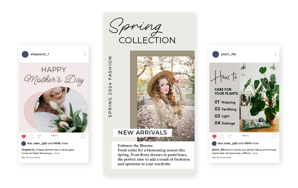
This is due to its specific look and feel that is both welcoming and inviting. Peep the graphics below to see exactly what we mean.
While it is a beautiful choice and can truly enhance the overall feel of a design, there are a few guidelines that can be implemented to make this font more effective and ensure its longevity in the font game and within your designs.
Proper Usage for Script Fonts
1. Consider the context
Consider the context in which you are creating a design. If you are designing for a luxury brand, or creating invitations to a fancy event, a script font may be the perfect choice.
When it comes to digital designs, billboards, or anything where readability is key, it might not be the best fit.
Pay attention to cultural considerations, audience expectations, and brand guidelines to ensure that your design effectively communicates its intended message.
2. Use sparingly
When it comes to script fonts, less is always more.
Flowy cursive typefaces are not intended to be read in large sections of copy, or even a long sub-heading of text.
When this type of font is used at a small point size, it becomes difficult or sometimes impossible to read what it has to say. Making your audience squint or strain to read your message is a surefire way to lose their interest.
Save these fancy fonts for big, short headings where they can truly shine and make an impact.
It is also a good idea to avoid overloading your design with multiple script fonts, as this can lead to visual clutter and confusion. Instead, focus on using script fonts selectively to create impact and visual interest.
3. Stick to well-known words
Because script fonts can prove more difficult to decipher, it's wise to use them on only well-known or easily recognizable words. If your audience cannot read or understand the words you are expressing, your message can lose its impact.
To retain the clarity and power of your message in your design, use words that are easily read in the font chosen, and easily recognized by your reader.
4. Pair with contrasting fonts
If you want to include a script font in your design but still want to retain a sense of flow and hierarchy, pairing your font with a contrasting typeface is a great choice. This allows the script to stand out, while creating a balanced and harmonious composition with structure (stay tuned for a future blog post on this).
Experiment with different combinations until you find one that conveys your message effectively.
5. Note that not all script fonts are created equal
Not all script fonts are created equal. With countless options available, it's essential to choose the right script font for your project. Consider the tone, mood, and audience of your design.
Are you aiming for a formal, sophisticated look, or would you prefer something more casual and approachable? Select a font that aligns with the overall aesthetic and message of your design.
6. Prioritize Legibility
This is a big one. Can you text be read? That’s the most important question and deserves a “YES” every time.
Script fonts are generally recognized for their decorative and ornate nature, which can add a level of interest or sophistication to your design. However, legibility should be the first priority when utilizing a script font.
Avoid overly stylized options that sacrifice the readability of the text. Instead, focus on choosing a font that uses appropriate letter spacing, line heights and contrast that contribute to legibility.
When integrating script into the design, consider the size and amount of text to be displayed, ensuring the ease of reading.
A Few Examples:
Most designers are visual people (as we have to be!). Follow along for some visual design examples of both how to use and how not to use script. Pay attention to the elements that stand out, and which elements are not as visually important.
Do:
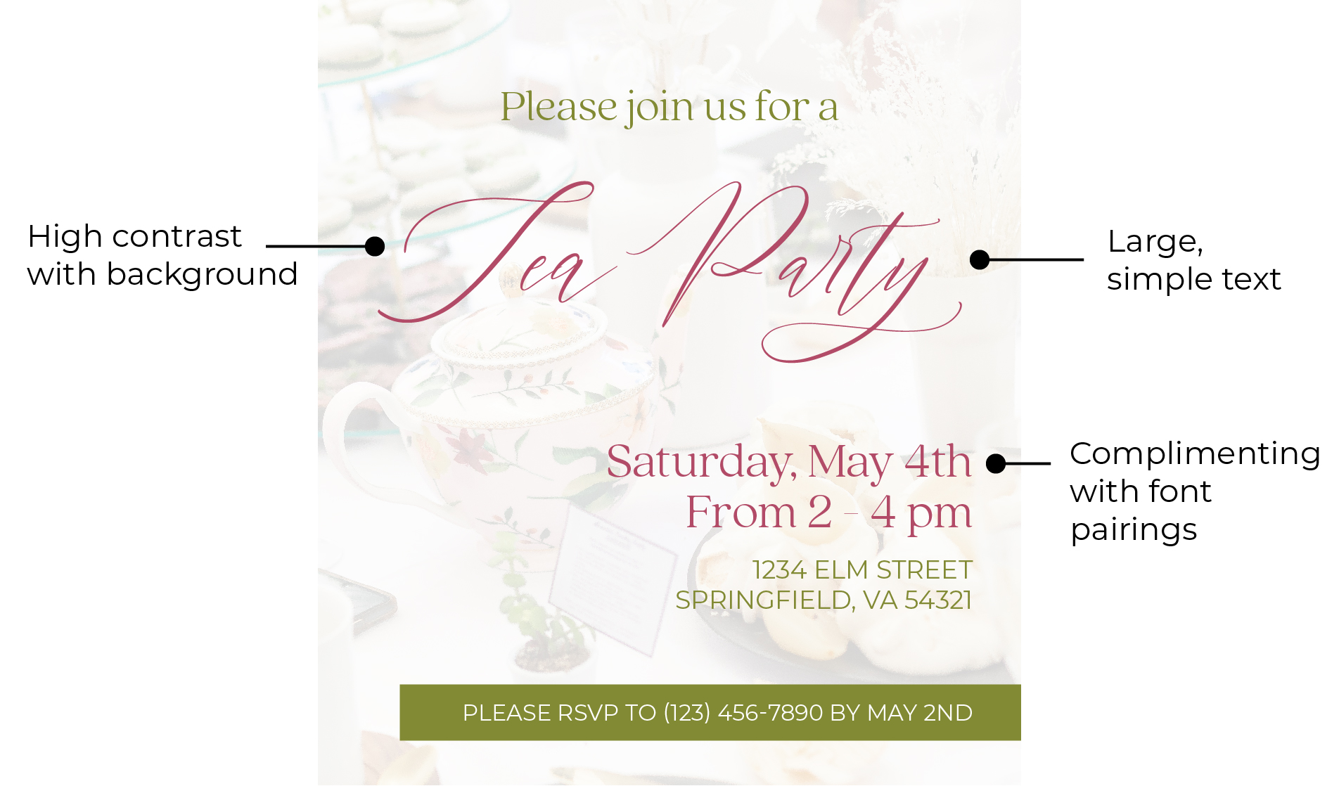
Our goal is not to scare you into not using the script fonts at all, but to help you elevate your designs in style. In this invitation design, the script is the main title for the event, which establishes a clear hierarchy in the composition. The title is the largest text in the design and has a high enough contrast against the background that it can be easily read. The composition also pairs a sans-serif and serif font to continue a clear hierarchy and complement the script font. The chosen font is also a great choice for an event such as a tea party. The design feels more feminine and is appropriate for a more formal, elegant event.
Don’t:
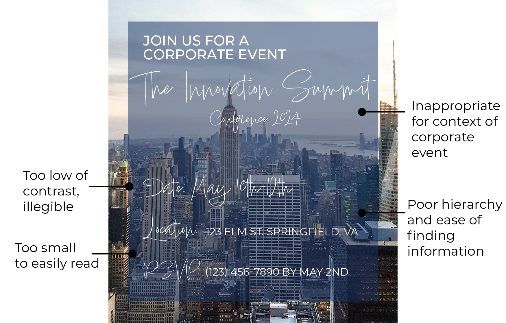
In this corporate conference invitation, several common mistakes are being showcased. While the design itself is not a displeasing aesthetic, there are several problems with the usage of the script font.
To start, an informal, hand-written font may not be the most appropriate for a corporate event. Secondly, the script font is overused and is no longer the central focus in the design. There is little contrast between the font and the picture in the background, making it difficult to read. The size of the subheadings also gets too small to easily decipher the text.
This is a common example of overusing a good thing and should be avoided.
We’ll say it one more time…script fonts can be powerful tools for adding personality and flair to your designs when used correctly. By following these tips and guidelines, you can harness the beauty and versatility of script fonts to create visually stunning and effective designs that captivate your audience. Remember to prioritize legibility, balance, and context to ensure that your designs make a lasting impression. Happy designing!
NEED A HAND WITH YOUR NEXT DESIGN PROJECT?
Stimulus Advertising is a full-service marketing and advertising agency. We work to provide creative services to companies and organizations within a variety of business segments and markets. If you are looking for a team to help you with your next design project, look no further than Stimulus! Our team of highly-trained designers and web developers will help you with anything from a new logo/brand to a new website and everything in between. Contact us today to learn more about our services and tell your brand story!


