

Montserrat Google Font Pairing
We've all been there:
"What font goes best with ______________?"
Finding the right font pairing can be challenging. Whether it's for a print piece or for a website, font harmony can make a huge difference to the impact of your piece. Let's take a look at the very popular Google font—Montserrat. Below we explain the history of the font, its characteristics and three good font pairings that can be used on print collateral or web design.
History
This typeface was designed in 2011 by Julieta Ulanovsky, a typographer and graphic designer based out of Buenos Aires, Argentina. She drew inspiration from the Montserrat neighborhood of Buenos Aires, especially in the traditional posters found there. According to Google Fonts, she wanted to “design this typeface and rescue the beauty of urban typography that emerged in the first half of the twentieth century.” Montserrat has become one of the most popular sans serif fonts on Google Fonts in 2023, with over 16 million websites using Montserrat.
Characteristics
Montserrat is characterized as a sans serif and includes many different weights and styles, such as Thin 100 and Black 900. This offers variety and versatility to the typeface, which is why it is a good choice for multiple platforms, including print and web design. The x-height of the typeface is tall, which makes the typeface easy to read as both body text and headers. The geometric quality of Montserrat maintains a balance between rigidity and curves in the letterforms. This balance between straight lines and curves is what makes Montserrat so versatile.
The ability of this typeface to be used in web, print and other design platforms makes it a popular choice for designers across the globe. We love the clean and geometric look of this typeface, especially the balance between each letterform to create a consistent look throughout.
A sans serif such as Montserrat conveys a sense of modernism, confidence and cleanliness.
Font Pairing 1: Playfair
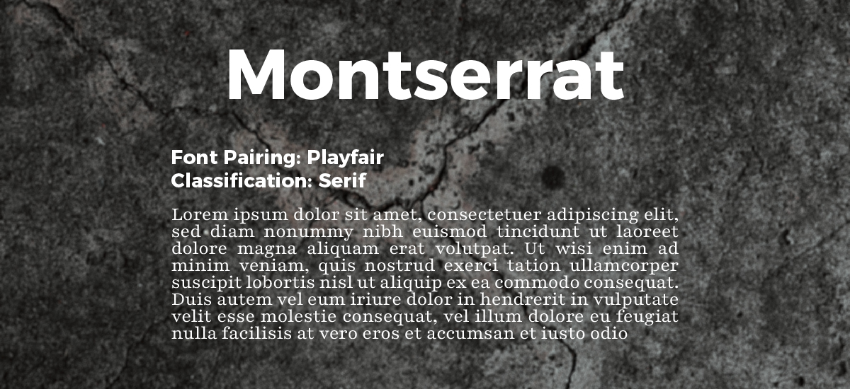
Classification: Serif
Use: Header or Body Text
Montserrat and Playfair make a great pair, because, like any good relationship, they balance each other well. Montserrat brings a more modern look to the table, while Playfair adds a more traditional and trustworthy look to the combination.
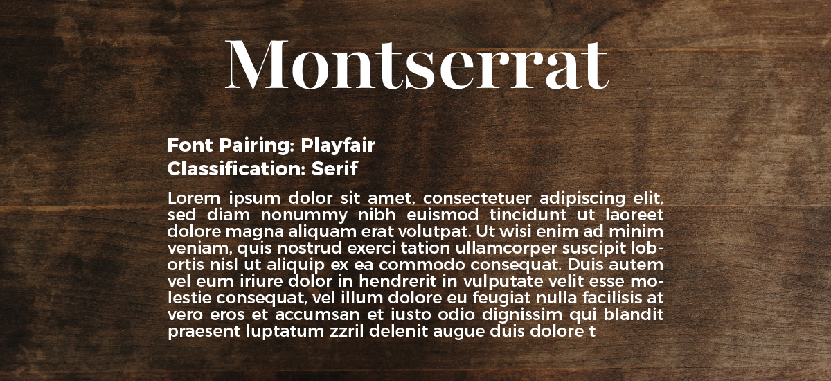
This combo brings the best of both worlds because either typeface can be used as the header or body text in the pairing. We especially like Playfair because the thick-to-thin contrast creates a nice balance of weight. The curves of the letterforms give the feeling of “play,” while remaining a clean and professional font choice.
Font Pairing 2: Montserrat Alternates
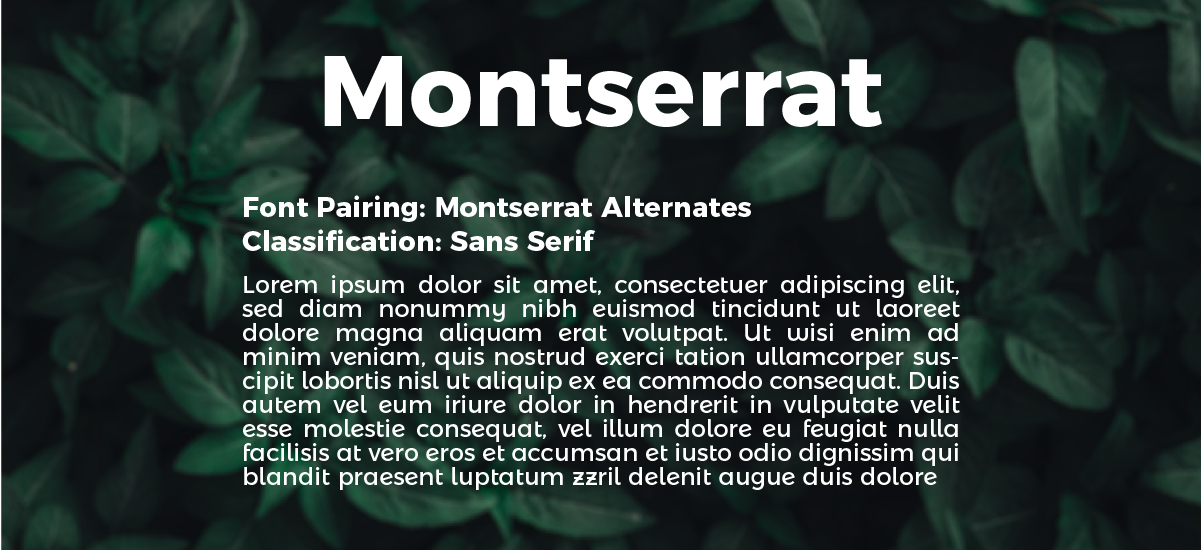
Classification: Sans Serif
Use: Body Text
The Montserrat Alternates font family was created as a sister family to Montserrat. The pairing works well together because they were created by the same typographer with Montserrat in mind.
Though the typefaces are not twins, they definitely look related! The letterforms for both fonts are geometric, but the Alternates family brings a more curved, modern option. We appreciate Montserrat Alternates' mono-weight, modern look with a balance of straight lines and wide curves.
This font is an excellent alternative to other modern sans serif fonts that are overused, such as Futura (don't even get us started).
Font Pairing 3: Gloock
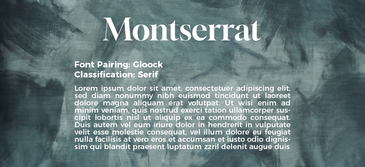
Classification: Sans Serif
Use: Body Text
Gloock...you probably haven't heard of this one unless you are immersed in the world of fonts. But alas, Goock is a font that provides a fun, bold header option for any design. It is a display font that takes the best attributes of newspaper headline fonts and makes them modern and fun!
Like Playfair, Gloock is a serif font that has a high thick-to-thin contrast. The sharp edges and geometric nature of the serifs bring interesting visual elements to the font.
Its new take on a classic look is much appreciated. Gloock creates interesting headers to accompany a body copy of Montserrat, providing more visual interest outside of the same classification or font family.
This is a great combination because the contrast in style naturally creates a sense of hierarchy and variety.
We hope you appreciate these font pairings as much as we do. It's always challenging to find fonts that go well together and instead of scouring the internet and looking for designers who may have some ideas, we figured we would start providing our own ideas. Keep an eye out for more fonts and their pairing coming soon. We are definitely thinking about making this a monthly series to help designers just like us find the perfect font pairing.
Let us know if you would like to see even more options for each font! Make sure to connect with us on social media where we will let you know each time we have a new blog post! Until the next font pairing, design wisely and create!
Need a Hand with Your Next Design Project?
Stimulus Advertising is a full-service marketing and advertising agency. We work to provide creative services to companies and organizations within a variety of business segments and markets. If you are looking for a team to help you with your next design project, look no further than Stimulus! Our team of highly-trained designers and web developers will help you with anything from a new logo/brand to a new website and everything in between. Contact us today to learn more about our services and tell your brand story!


